
Creative Director, Art Director, Lead Designer
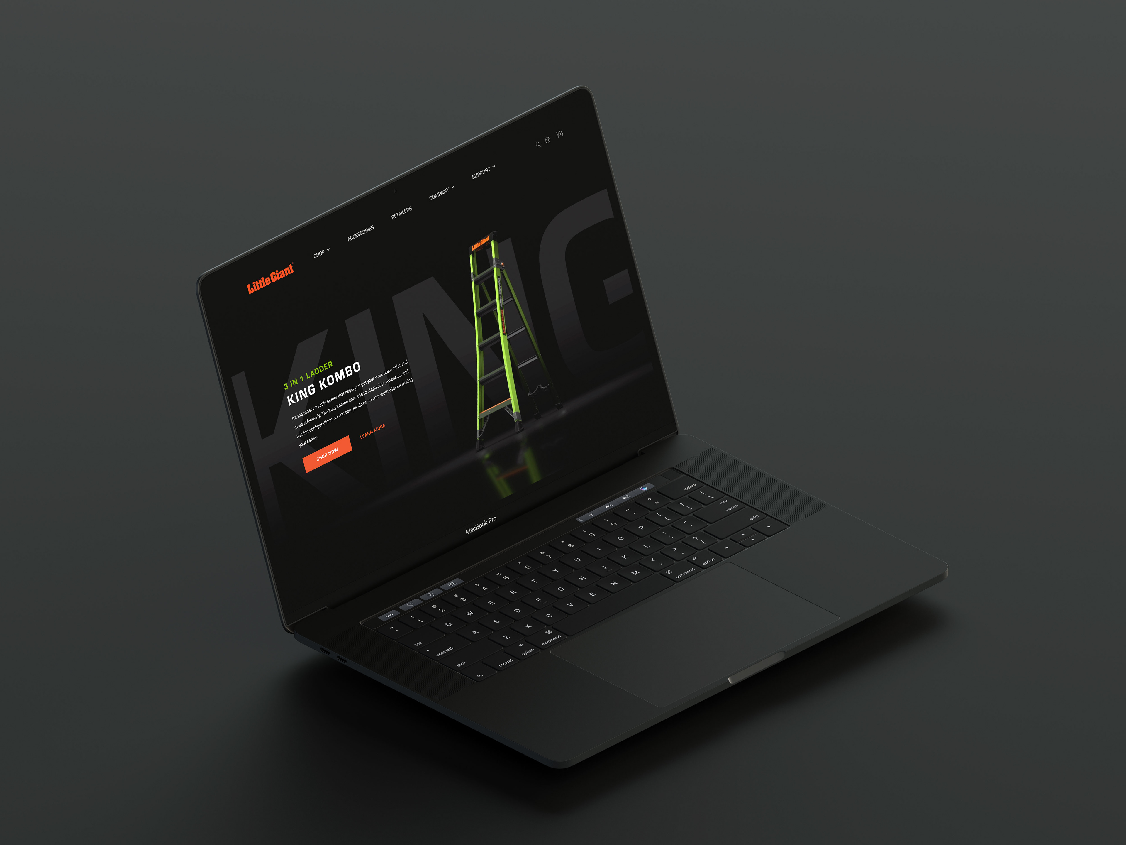
I was the art director over the redesign of Little Giant Ladder's website. We sought to give the site a fresh new look with dramatic imagery, improved UX, 3D animations, and the incorporation of an ecommerce experience which had not existed on their previous site. I executed on the UI/UX of the site, from developing a sitemap, wireframes, prototyping, establishing the look and feel, and fleshing out the final designs for each page. I also directed our 3D artist and animator in creating the page animations.
Sitemap
Little giant wanted an eCommerce experience built from the ground up to replace their outdated site. Beginning with the sitemap, we addressed the basic navigational structure of the site to help offer the simplest path to purchase for their users.

Wireframes
Little Giant Ladder needed a better solution for showcasing their wide variety of ladder products. Our solution was to seamlessly funnel users down from broad ladder types to more specific product families, and then to groups of ladder models. I wireframed the core pages and product templates and created a clickable prototype to quickly address the complex issues of creating an enjoyable user experience.
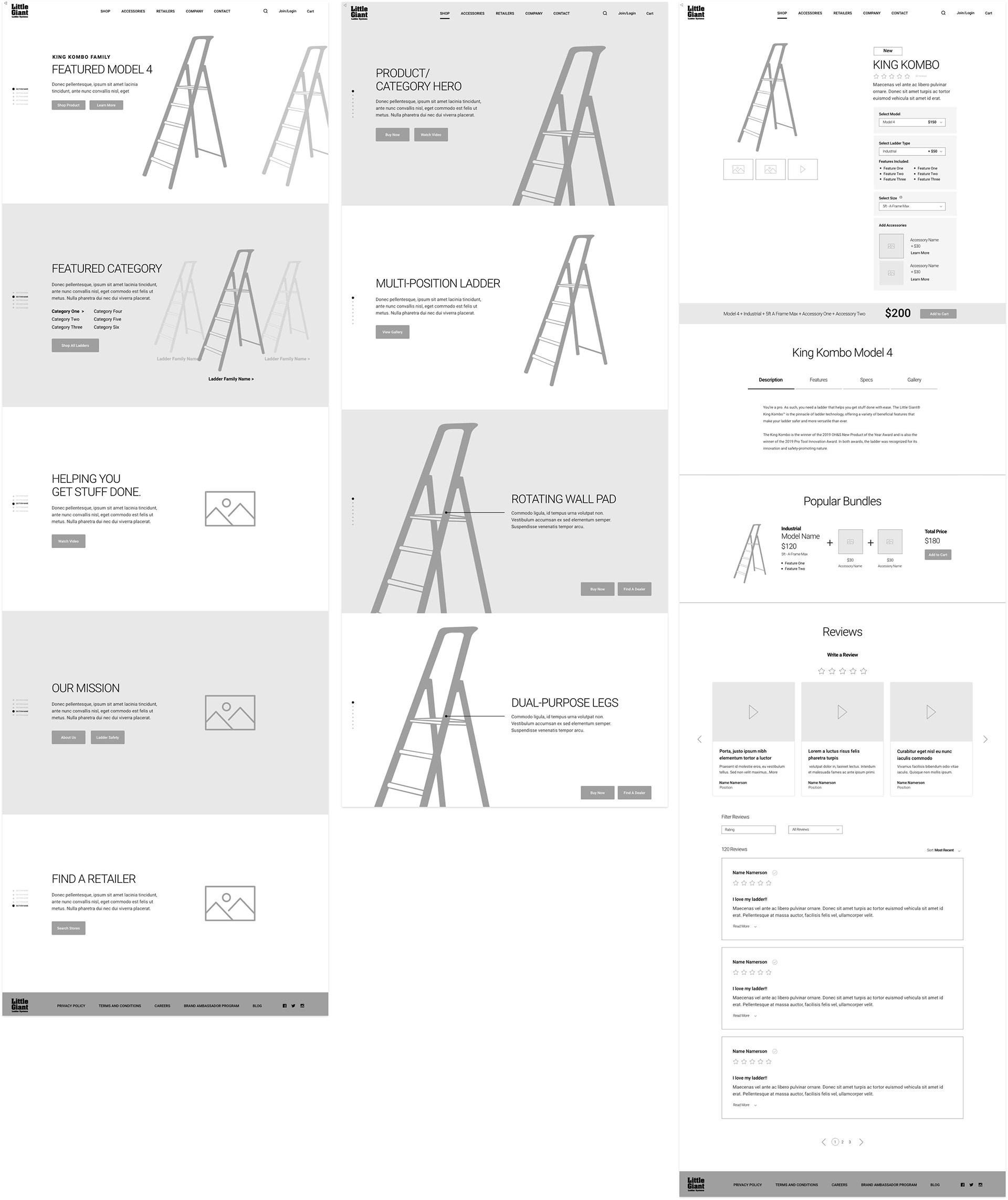
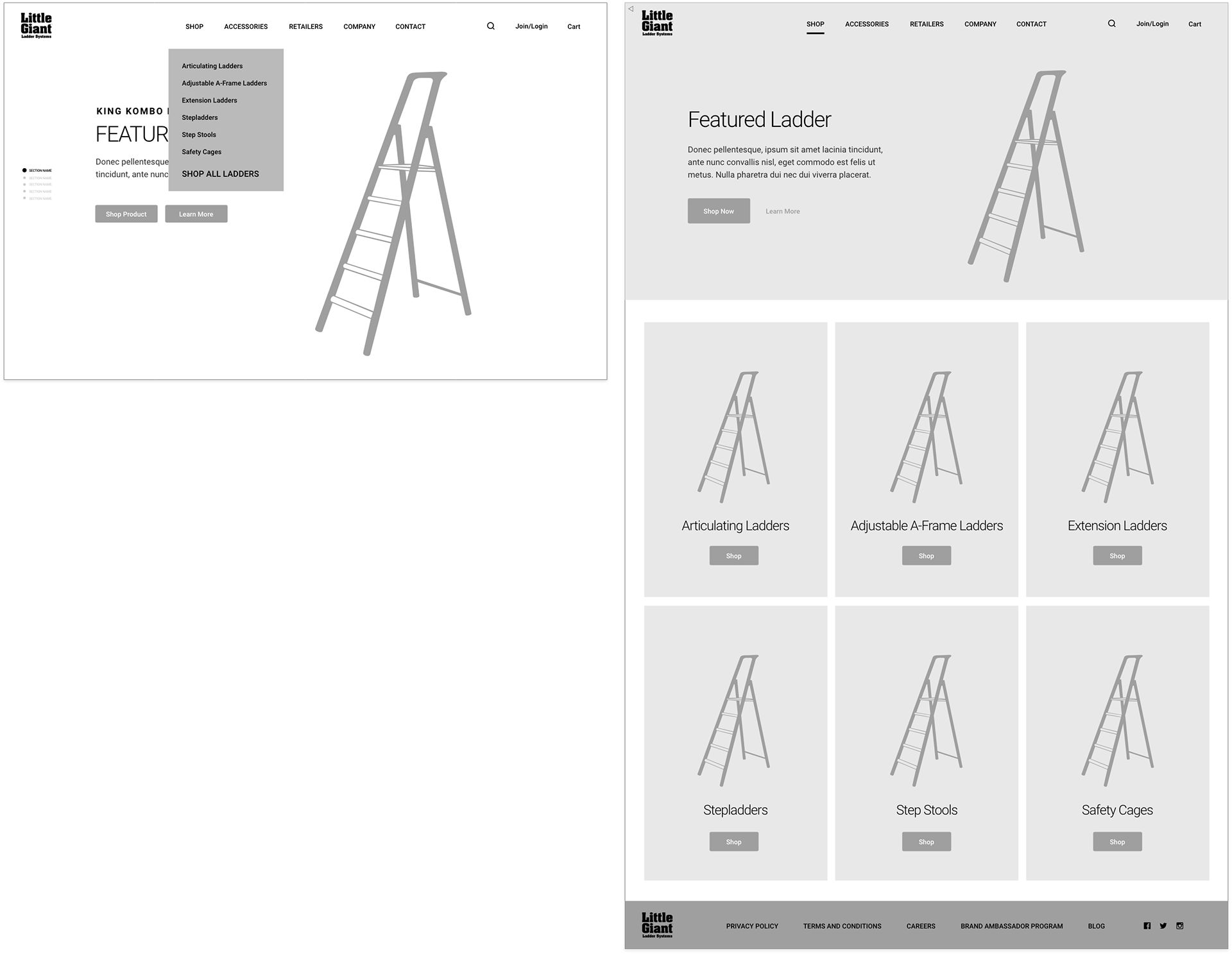
High Fidelity Designs
A variety of product and category specific modules, as well as the drop down navigation, allowed users to quickly navigate to the ladder product page most meaningful to them.
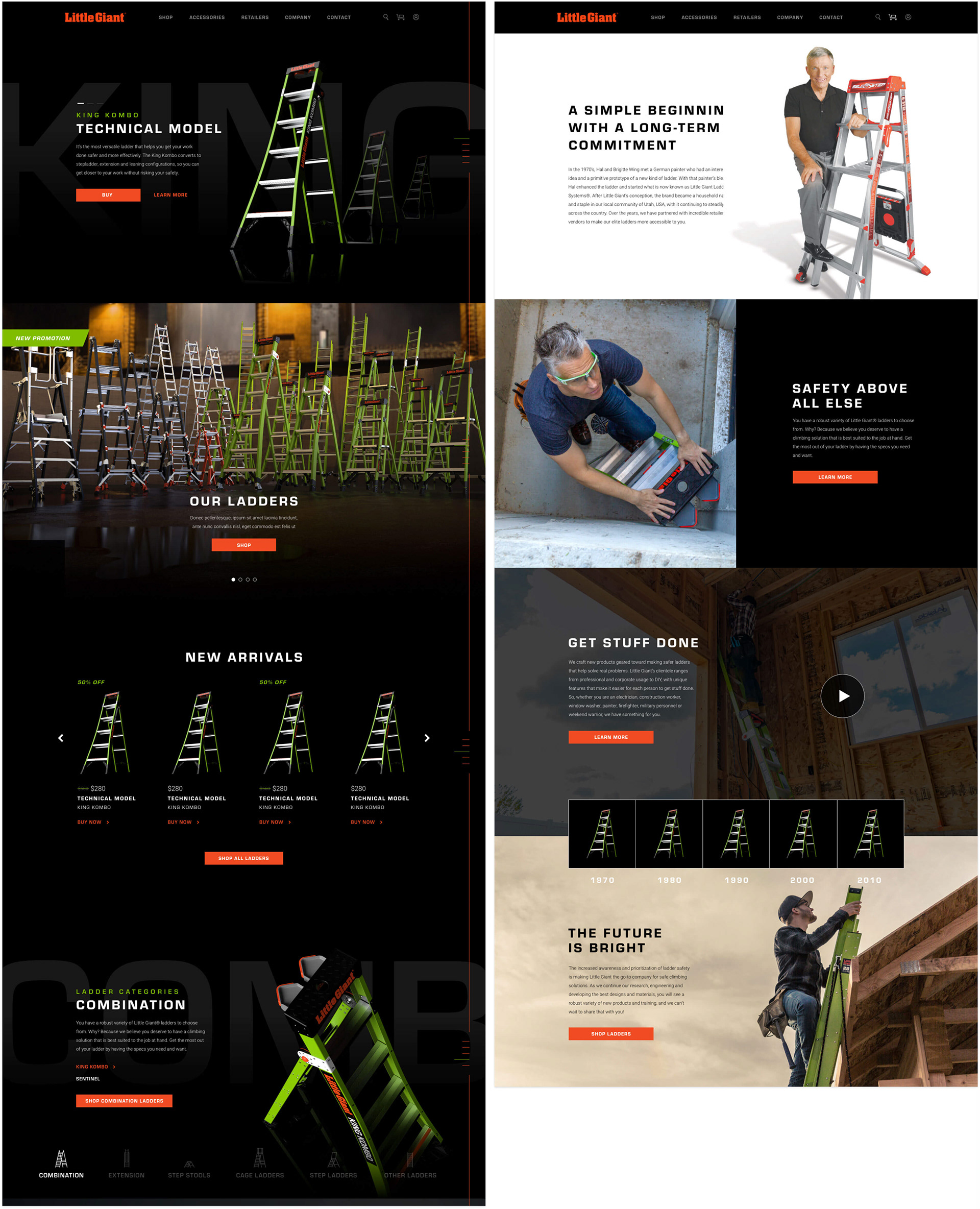
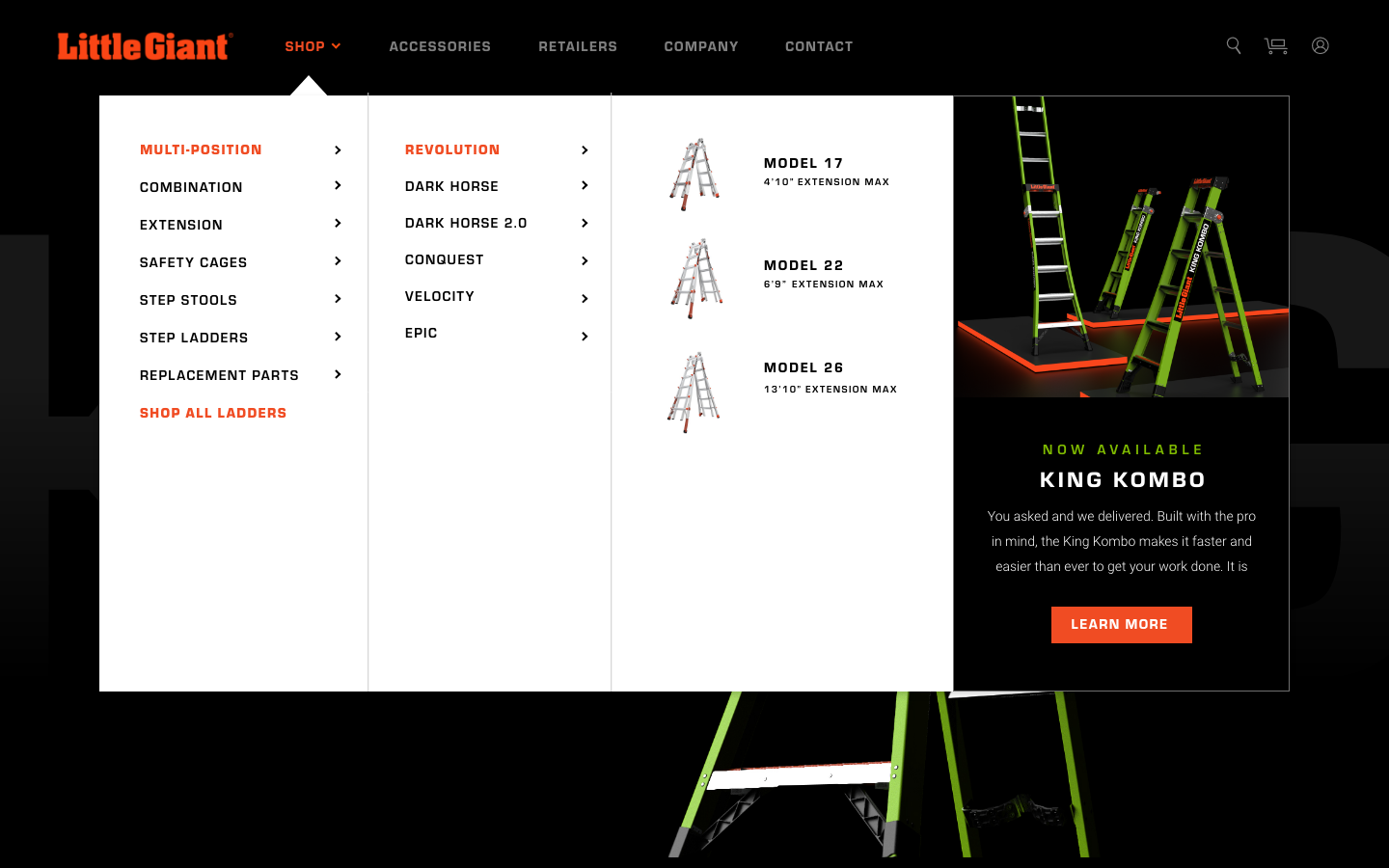
Shop Mega Nav: HELPING USERS FIND THE RIGHT LADDER FASTER
Users in the past had struggled with finding the right type of ladder for the job, and Little Giant Ladder's overwhelming product inventory wasn't helping. By researching and analyzing other company sites that sell a large variety of product types, I found a great way to simplify the process for the user was to create a simple mega nav that broke down the shopping experience into ladder types, ladder families, and product models.
Mega Nav Wireframe
I designed a simple wireframe to help establish the basic functionality of the navigation. Users were still able to navigate page by page if they preferred by selecting "Shop All Ladders", or they could dive right into a specific ladder type from the drop down menu.
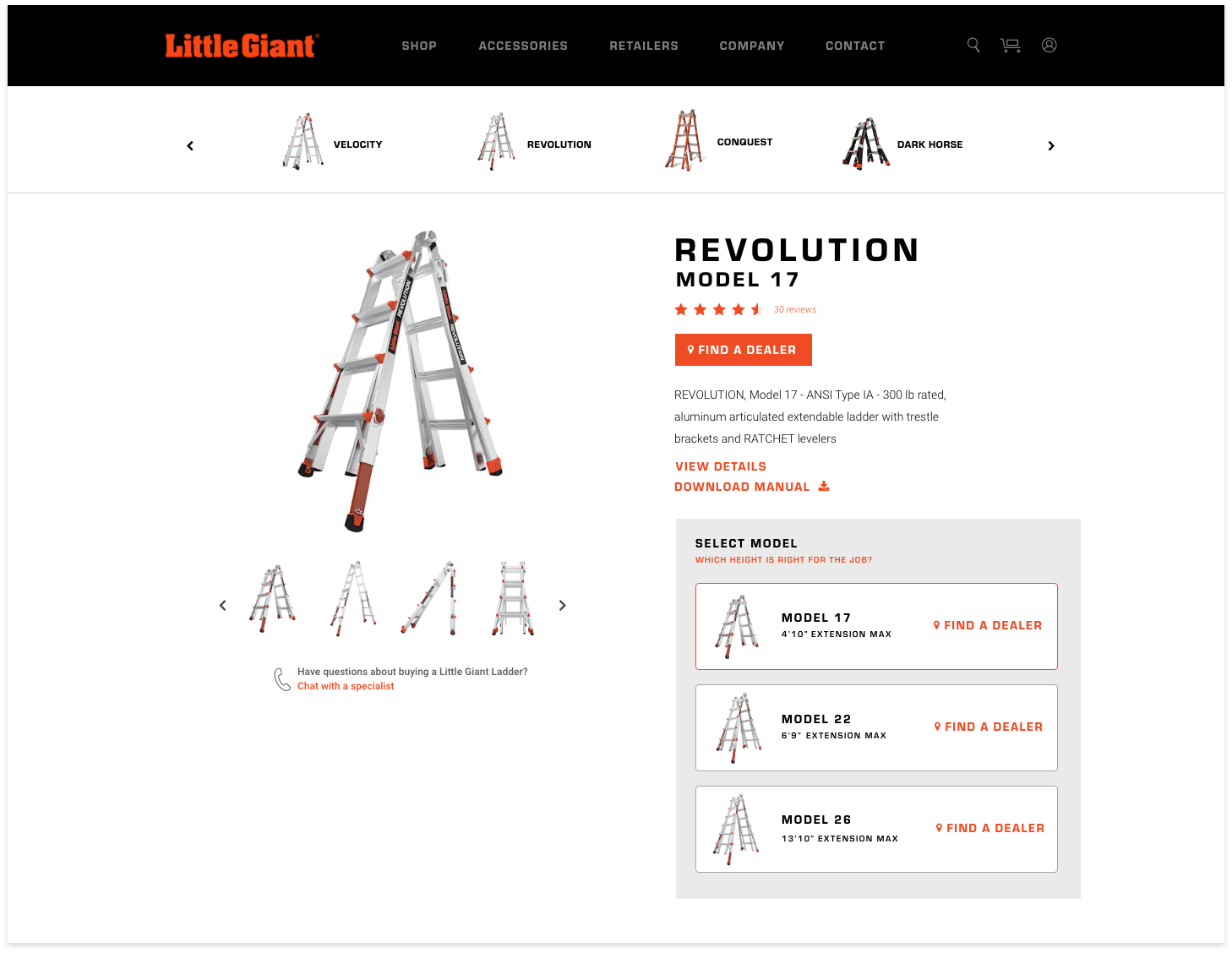
High-Fidelity Designs
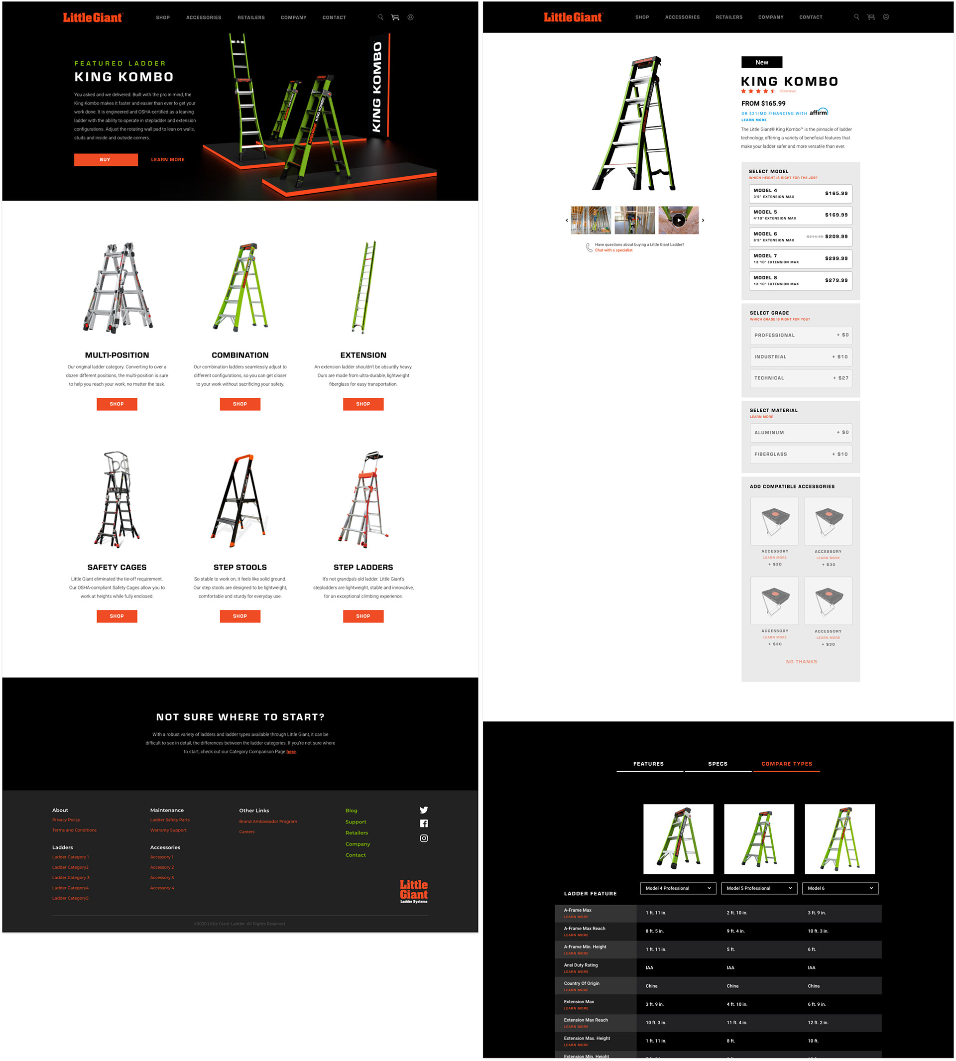
The wireframe was later built upon and improved in the high-fidelity design phase to accommodate the mega nav structure. Now users were able to quickly funnel through ladder types, families, and models with a minimal amount of clicks.
Once users have navigated to their ladder of choice, they are able to explore a variety of ladder models. Feedback from users on the old site informed us that one of the biggest pain points was not having the height of the ladder easily visible for each ladder model (a huge issue!). To fix this, I included the height of the ladder with the model name in both the mega nav and product detail page.
The user's model selection repurpose the specs and information tabs below the product listing so that users are always getting the information most relevant to their selection.
The ladder thumbnail slider at the top allows users to navigate to other ladder families related to the current ladder type to easily explore other options. View the desktop and mobile designs.
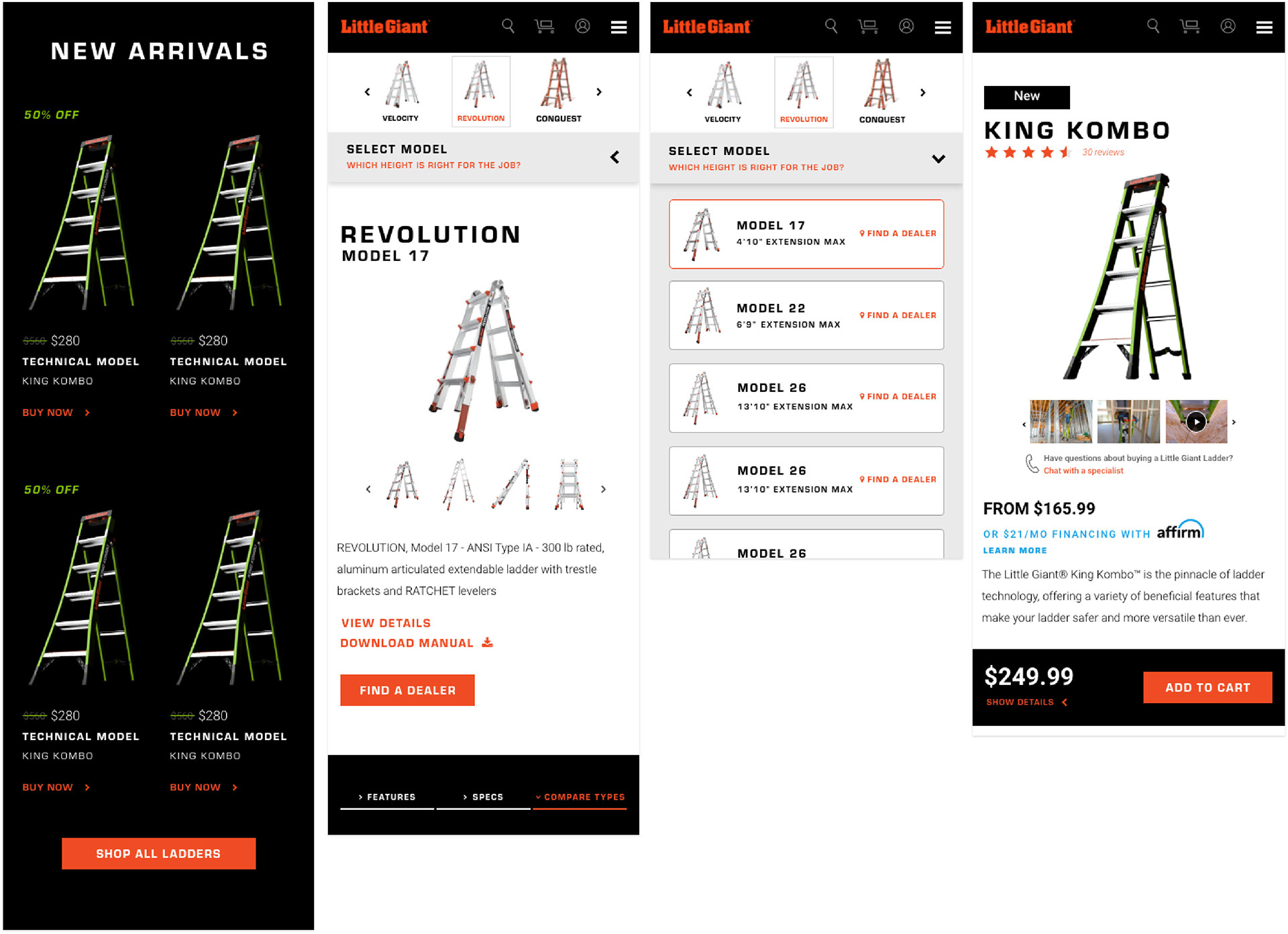
Mobile Design
Each page was designed in a way to accommodate the largest desktop screens to the narrowest mobile screens. We revisited every module to make sure it was simple and intuitive no matter what device it was being viewed on.
Results
High-contrast colors, sophisticated and isolated product imagery, clear CTA’s, and a better product navigation all lead to drastically decreasing the bounce rate of the site and kept users engaged with the content.
In the first several months of launching the site, the bounce rate was slashed from nearly 50% to 10% and the conversion rate increased by nearly 4 times.
We continue to iterate and improve on the site based on feedback from users and Little Giant Ladder to help drive sales and increase conversion rates.